Turn Car Web App MVP
Product Overview
Turn Car is a car subscription service offered online through web, iOS, and Android platforms. With Turn, you can subscribe to a car for as long as you want and receive included benefits such as basic maintenance just by paying a Starter Payment and Monthly Payment.
Project Intro
In addition to the native mobile apps, Turn Car also provides a web platform for users to browse and subscribe to cars. I worked on the visual and interaction design for this web version of the product after the launch of the iOS MVP.
The Opportunity
There were a number of reasons why we decided to pursue adding a web platform to the product.
Based on data of usage by platform that we had collected from a sister product, we knew that mobile web was one of our most highly accessed platforms.
We wanted to be able to reach a wider audience, which a web application would be able to help us achieve due to its inherently device-agnostic properties.
We knew that we wanted to expand into international markets which have a far lower amount of iOS users compared to Android users and desktop users.
My Role
Together with my manager, we were the 2 product designers working on the UX design, visual/interaction design, and UX writing for the Turn Car web application alongside 1 frontend web engineer and 1 backend engineer.
Constraints
Due to business requirements, we had a short timeline of one sprint (in our case, 3 weeks long) to design and implement the MVP of the web app.
Given this short timeframe, we constantly worked side by side with the engineers to ensure that the designs were a feasible level of effort to complete by the deadline and uncover technical constraints as we went along.
We needed to work quickly which pushed us to head straight to high fidelity designs once we mapped out the basic product architecture and experience.
Site Map & Dynamic Navigation Bar Design
To kick off the web application design, my manager and I worked on a site map which allowed the team to have a common understanding of the structure of the web app.
Additionally, we carefully planned out how we wanted to design the navigation bar throughout the different stages of the conversion funnel.
Our goal with the dynamic navigation bar was to help users advancing down the funnel better lock in on continuing the path to subscription rather than potentially become distracted by other page links.
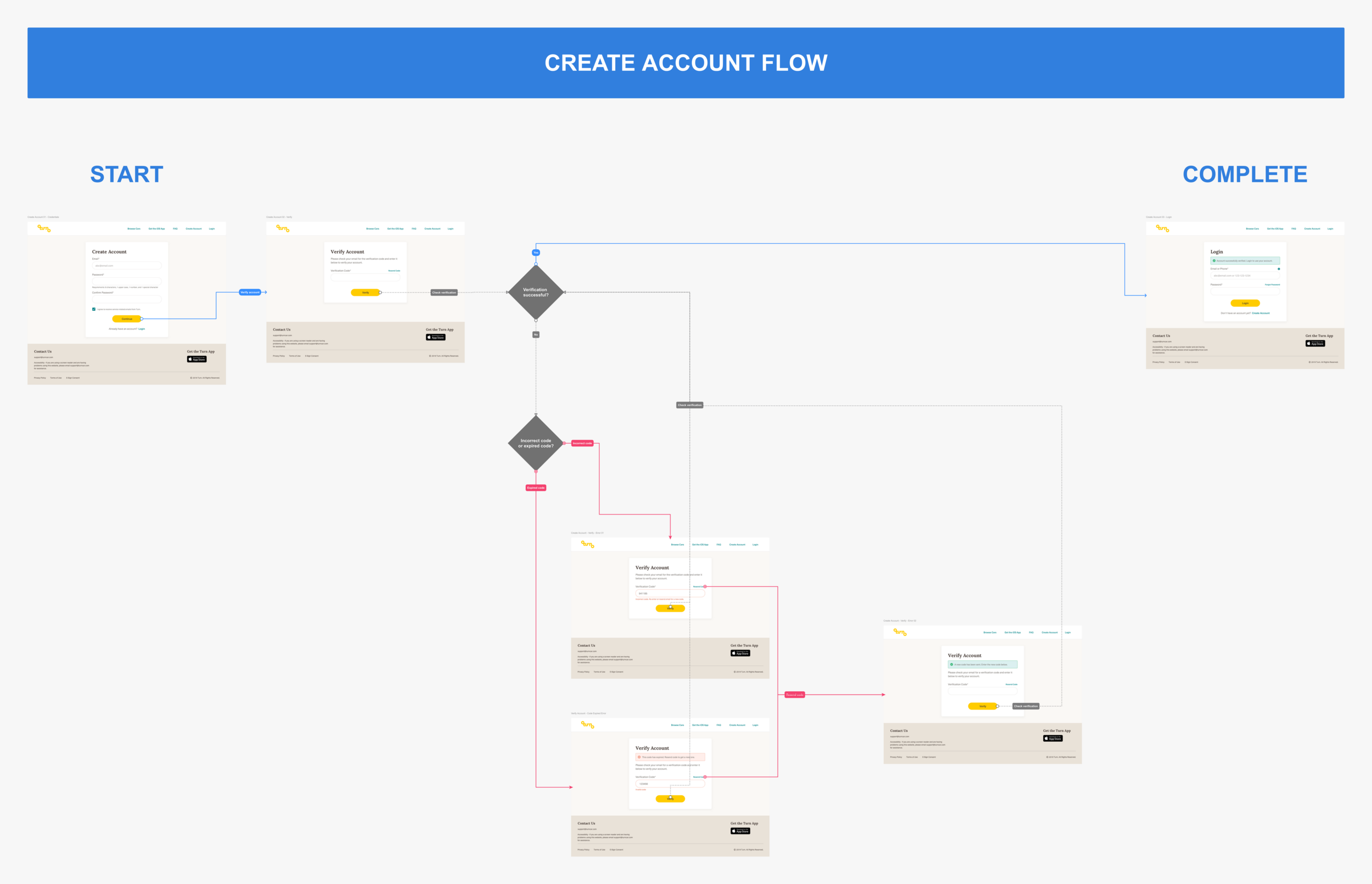
Create Account & Login Flow Design
I had the opportunity to work on the UI/UX design for the Create Account and Login flow designs for the web application. There were a few technical constraints for the overall flow, so I worked together with the engineers to understand the technical steps required for a user to create an account and to identify any special use cases or edge cases that may need to be designed as well.
Site-wide Interaction Design
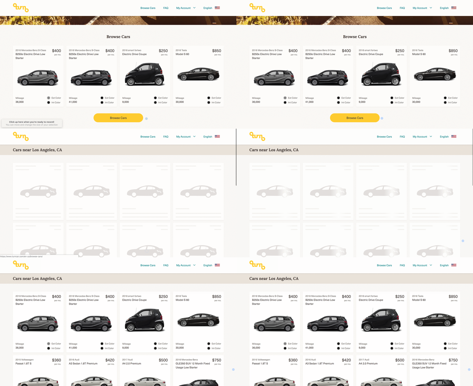
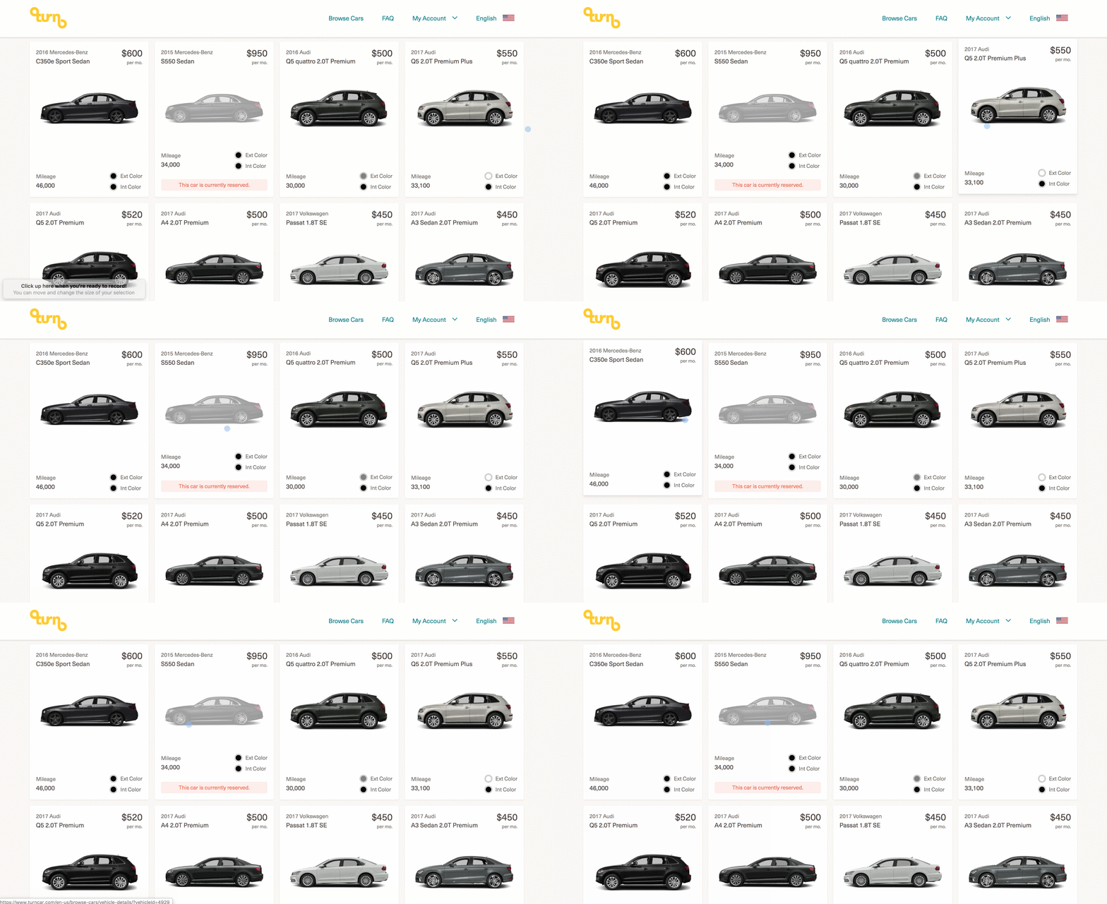
Together with the frontend web engineer, I designed a few foundational microinteractions to communicate feedback faster back to users and increase the discoverability of possible interactions.
Some of these microinteractions include dynamic button states, hover states for clickable cards (along with an unclickable state), empty states, error states, and loading states for various pages and components.
Along with providing the visuals, it was also important to specify how these interactions may differ depending on if the user was interacting through a desktop or a mobile device.
I also provided designs for empty states of certain subscription related account pages if users had an account but were not subscribers yet.
Responsive Web Design
Another important dimension that we continuously kept track of was the responsiveness of the web application and how the different components and pages should scale depending on the user’s viewport or device.
I worked together with the frontend engineer to define and check the responsiveness during development and pre-launch during design QA sessions.
Reflections
I truly loved getting the opportunity to be able to design and build this web app from the ground up alongside the developers.
It was also really eye opening to learn about some of the considerations to keep in mind when deciding to scale your product to an additional platform from both business and technical perspectives:
When adding another platform, although consistency is important, it is also important to leave room for discussion of how potential improvements can be integrated based on data from the other platforms’ usage.
It’s extremely important to keep in mind the differing user behaviors and patterns between each platforms and how those differences might influence any changes in the design and flows.
Expect users to switch between the two platforms once both are available, so strongly prioritize how to factor in the potential device switching might affect the overall product experience to make it more seamless and easy to switch.
Have Questions?
Of course, this summary is just the tip of the iceberg for a peek into the behind the scenes of this project.
If you’d like to chat more about it, send me a note and I’d be happy to discuss further!


